
The Burrow Dashboard Home Page
3 min read · Last updated · Page version 4
The home page is Burrow's SOC overview - the screen to open first thing and the one to leave up on a wall. It answers "what happened overnight, and what needs me?" without opening a single alert.
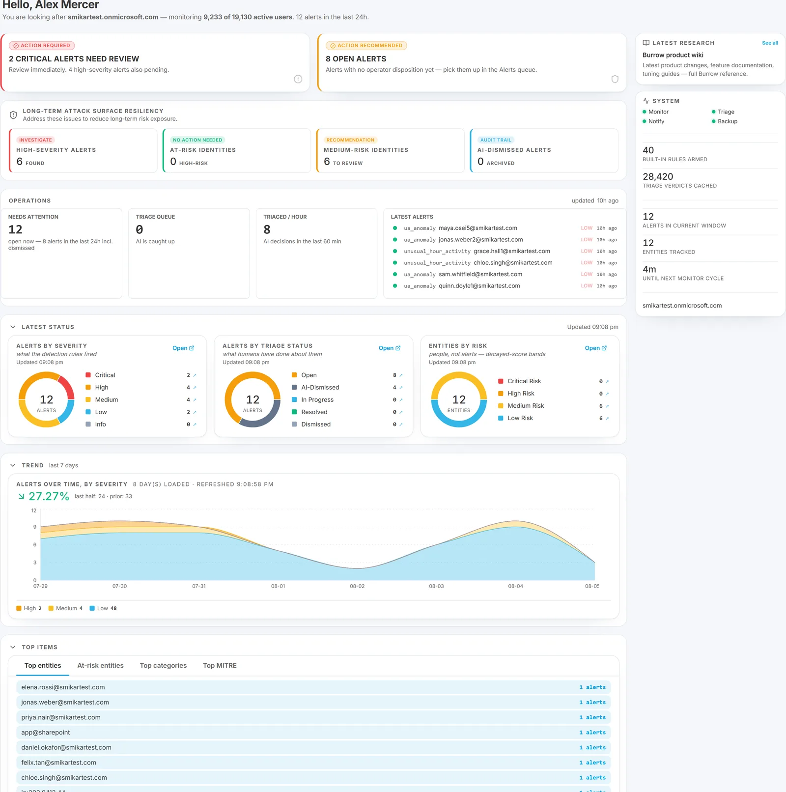
The coverage line
The greeting at the top names your tenant and states how many people Burrow is monitoring - "monitoring 9,233 of 19,130 active users". The first number is people with meaningful SharePoint activity in the last 30 days; the second is the enabled accounts in your directory. Dormant accounts and service identities are not counted.
It is the quickest answer to "is Burrow actually covering our organisation?". The Setup page breaks the same figure down further.
The Operations strip
Four tiles across the top:
- Needs attention - alerts genuinely awaiting a human. This is the same figure the Alerts page shows on its default Active tab, taken from the same source, so the two screens always agree. The sub-line gives the raw count for the lookback window (which includes everything already dismissed), so you can see both without confusing them.
- Triage queue - alerts still waiting on AI triage. Zero means the AI is caught up.
- Triaged / hour - AI decisions in the last 60 minutes.
- Latest alerts - the most recent signals, colour-dotted by AI verdict.
The three donuts
- Severity breakdown - critical / high / medium / low in the current lookback window.
- Disposition breakdown - Open (awaiting a human), AI-dismissed (the AI judged it routine and no human has acted), In progress, Resolved, Dismissed.
- Risk-band donut - how many identities sit in each risk band.
Open and AI-dismissed are deliberately separate slices. "Open" means the same thing here as on the Alerts page, so an alert the AI has already quietened can never inflate your to-do count. If the two were merged you would be looking at a number that overstates the work.
Trend and Top items
A Trend chart shows daily alert counts, severity-stacked, over 7, 30 or 90 days.
A Top items card switches between four tabs: Top entities, At-risk entities, Top categories, Top MITRE.
Everything is a link. Clicking any donut slice or top-item row opens the Alerts page pre-filtered to that selection - the intended path from "something looks off in this slice" to the actual alerts.
Why the totals differ from the Alerts page
A common early question, and both screens are right - they answer different things:
- The home page covers the last 24 hours, and its raw count includes alerts already dismissed.
- The Alerts page covers the full retention window and defaults to showing only what is still Active.
Needs attention is the figure common to both. Use it as the day's to-do count and treat the larger window figure as history rather than work.
See also
- The Alerts page - where every drill-down here lands.
- Quick tour of the dashboard - one paragraph on every other page.
- Weekly executive briefing - the same picture, written for people who do not open the dashboard.
- Who uses what - which pages matter for which role.
Need help? support@smikar.com.